
Logo for Without Whim
Without Whim has been a name without a face for the past couple years and needed a character to represent the art.
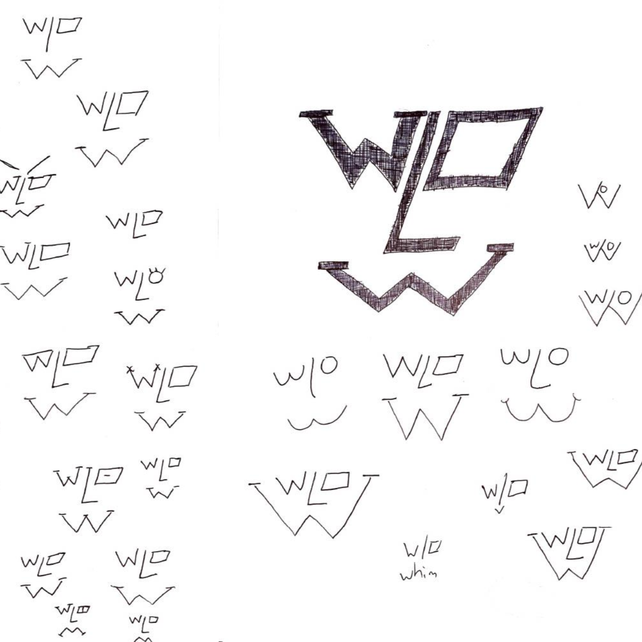
1. Some initial sketches of a scrapped logo idea for Without Whim.
2. Although rough, these sketches helped lay the foundational shapes of what the logo was soon to become.
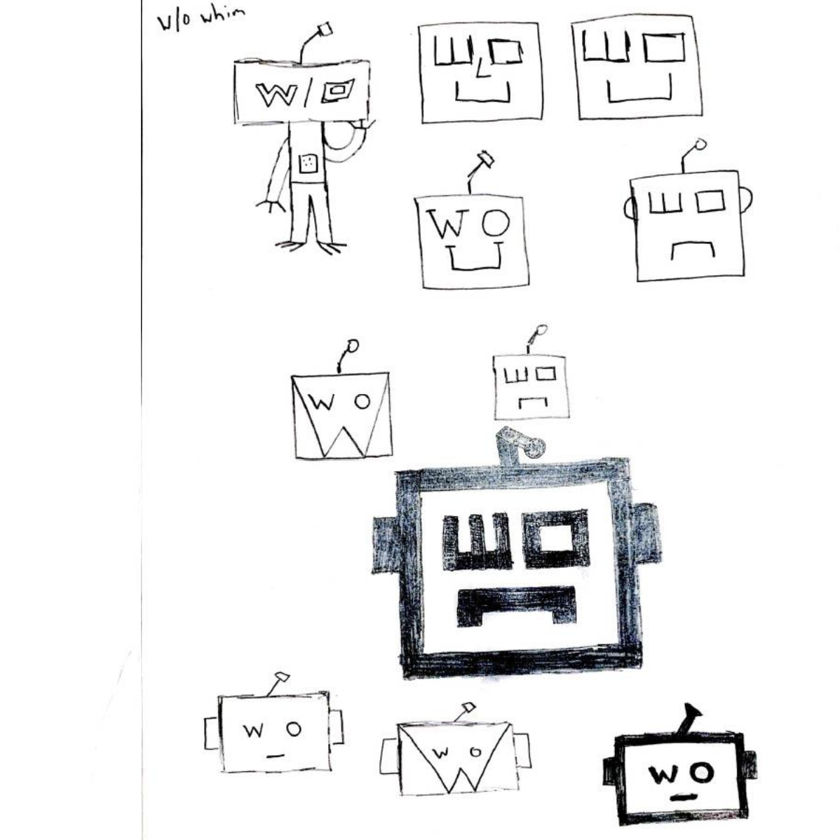
3. Decided to move forward with this robot concept based on feedback from peers and it was an overall personal favorite.

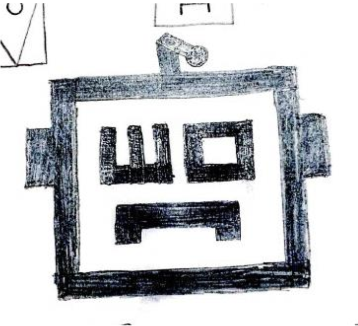
4. The final logo with its desired color palette. The robot eyes are the abbreviated form of without (w/o), showcasing the connection to the art persona.
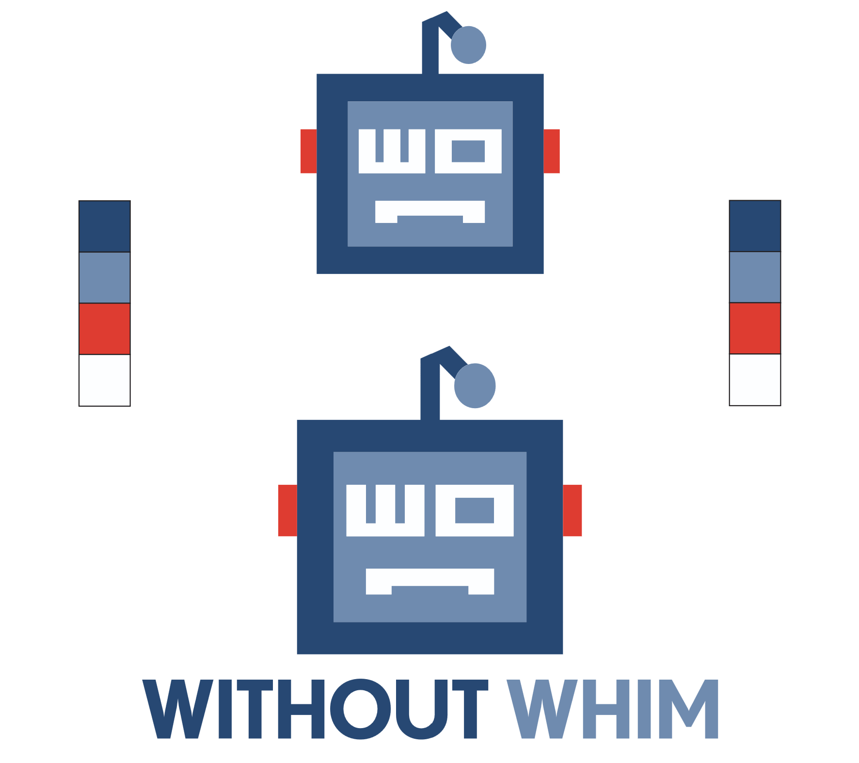
5. Although a mascot logo, it is also important for the logo to work as a combination mark. Due to a robots lack of whimsy, the logo is a perfect representation for the online persona of Without Whim.